
SVG(Scalable Vector Graphics) is XML-based image formats that can look crisp at all screen resolutions, can have super small file sizes, and can be easily edited and modified. There are many approaches to creating icon system like using icon fonts or loading external SVG. However, using 'Inline SVG' is the arsenal because it doesn't make any server request which could have had an effect on website's performance. Moreover, it is possible to make editable inline icons as component in Vue.js development.
Here is a general idea of how I create Vue components for SVG icons in my projects. As an example, two ' SVG icons, 'Play' and 'Pause' used in audio player component are going to be used.
Preparing & Optimising
You may easily obtain free SVG icons set as like open-licensed icons Material Design Icons or fontawesome. SVG optimisation can reduce SVG file sizes significantly as much as 20~80% smaller. Before production phase, every SVG should be manually optimised vector graphic editor, Illustrator or Sketch, SVGO(SVG Optimizer), a Node.js based tool or Online tool.
Here are some SVG techniques suggested by Varun Vachhar that make it easier to control the size and color of the icon.
- Ensure that all the icons use
viewBoxand remove anywidthorheightattributes. You can configure SVGO to do this for you automatically. This will make it easier to control the size of the icon. - Set the fill and stroke (or whichever of the two you are using) to
currentColor. This sets the icon colour to be the same as the surrounding text. We can then control this colour by setting the color property on the icon element.
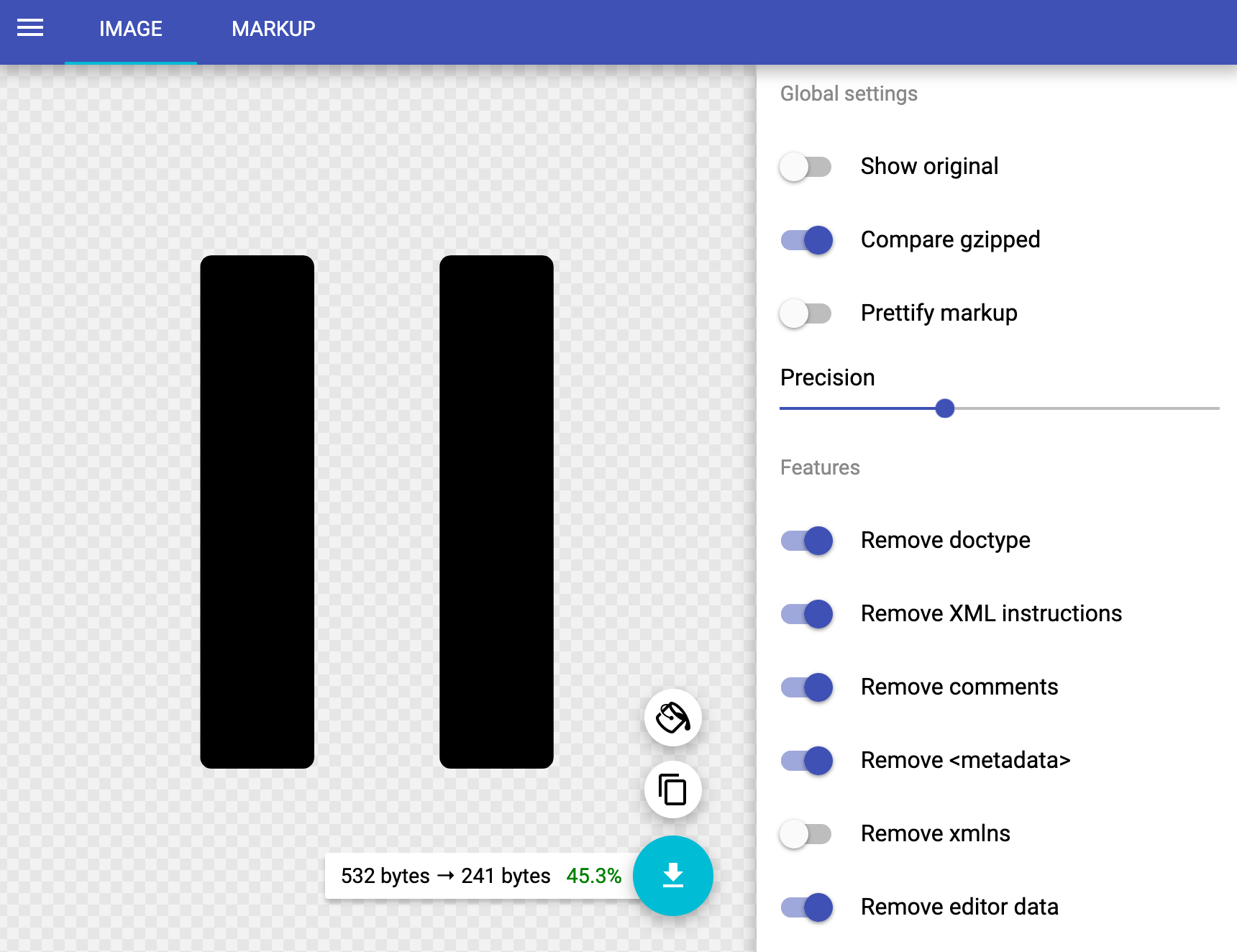
For example, the pause SVG Icon was reduced up to 45.3%.
vue-svg-loader installation and configuration
All SVG codes should be embedded inside HTML and it is essentially DOM which can be manipulated with CSS and Javascript. vue-svg-loader allows you to inlines SVG as Vue components and each imported SVG you import is optimised on-the-fly using powerful SVGO. After install package, configure new loader in webpack, Vue CLI, or Nuxt.js.
npm i -D vue-svg-loader vue-template-compiler

yarn add --dev vue-svg-loader vue-template-compiler
vue CLI
module.exports = {
  chainWebpack: (config) => {
    const svgRule = config.module.rule('svg');
    svgRule.uses.clear();
    svgRule
      .use('vue-svg-loader')
      .loader('vue-svg-loader');
  },
};
Dynamic imports + <component />
Let's assumes that icons are stored in src/icons folder. If every icon's SVG viewbox attribute would be same value, we may extract SVG's path and make vue component itself.
pause.svg
<svg xmlns="http://www.w3.org/2000/svg" viewBox="0 0 373 373"><path d="M301.201 7.721V349.19c0 4.269-3.457 7.729-7.715 7.729h-63.705a7.727 7.727 0 0 1-7.727-7.729V7.721c0-4.263 3.459-7.721 7.727-7.721h63.705c4.258 0 7.715 3.458 7.715 7.721zM127.142 0H63.438a7.72 7.72 0 0 0-7.721 7.721V349.19c0 4.269 3.455 7.729 7.721 7.729h63.703a7.726 7.726 0 0 0 7.723-7.729V7.721A7.722 7.722 0 0 0 127.142 0z"/></svg>pause.vue
<template>
  <path
    d="M301.201 7.721V349.19c0 4.269-3.457 7.729-7.715 7.729h-63.705a7.727 7.727 0 0 1-7.727-7.729V7.721c0-4.263 3.459-7.721 7.727-7.721h63.705c4.258 0 7.715 3.458 7.715 7.721zM127.142 0H63.438a7.72 7.72 0 0 0-7.721 7.721V349.19c0 4.269 3.455 7.729 7.721 7.729h63.703a7.726 7.726 0 0 0 7.723-7.729V7.721A7.722 7.722 0 0 0 127.142 0z"
  />
</template>
svg-icon.vue
It's time to create base component svg-icon.vue. Start base code with <svg .../> that used in icon SVG, remove width and height and make parent element <div>. <svg width="100%"> forces to make an SVG fit to the parent container 100%. preserveAspectRatio="xMidYMid meet" uniforms scaling for both the x and y, aligning the midpoint of the SVG object with the midpoint of the parent container.
Next, group <svg-icon-type /> with <g/> to fill color, wrap with <svg /> tag, add width, height, iconColor, iconType props which can be dynamically updated.
<template>
  <div :style="iconStyle">
    <svg
      width="100%"
      preserveAspectRatio="xMidYMid meet"
      xmlns="http://www.w3.org/2000/svg"
      viewBox="0 0 373 373"
    >
      <g :fill="iconColor">
        <svg-icon-type />
      </g>
    </svg>
  </div>
</template>

<script>
export default {
  name: "SvgIcon",
  components: {},
  props: {
    iconType: {
      type: String,
      default: () => null
    },
    iconColor: {
      type: String,
      default: "currentColor"
    },
    width: {
      type: [Number, String],
      default: 18
    },
    height: {
      type: [Number, String],
      default: 18
    }
  },
  computed: {
    iconStyle() {
      const { width, height } = this;
      return {
        width: `${width}px`,
        height: `${height}px`
      };
    }
  }
};
</script>
You may notice that we can insert icon name instead of <svg-icon-type> and it is possible to switch between components dynamically. Vue.js supports dynamic components. A built-in component named <component /> acts as a placeholder for another component accepts a special :is prop with the name of the component it should render. :is prop represents registered component or component’s options object.
<template>
  <div class="svg-icon" :style="iconStyle">
    <svg xmlns="http://www.w3.org/2000/svg" viewBox="0 0 373 373">
      <g :fill="iconColor">
        <component :is="iconLoader" />
      </g>
    </svg>
  </div>
</template>
Then how to load component? Inside computed properties, we can dynamically load specific component as a ES module. It reduces unnecessary tasks importing and registering every component. iconLoader() returns a promise that is fulfilled with the loaded icon or rejected.
  computed: {
    iconLoader() {
      return () => import(`@/components/icons/${this.iconType}.vue`);
    }
    //....
  },
Now you can import SvgIcon component and pass props.
button.vue
<template>
    <button>
    	<svg-icon width="50" height="50" iconType="play" iconColor="red" />
    </button>
</template>
Suppose toggle between play and pause icons in audio player.
<template>
  <button @click="playing = !playing">
    <svg-icon
      width="50"
      height="50"
      :iconType="playing ? 'pause' : 'play'"
      iconColor="red"
    />
  </button>
</template>

<script>
import SvgIcon from "./svg-icon.vue";

export default {
  components: {
    SvgIcon
  },
  data() {
    return {
      playing: false
    };
  }
};
</script>
However, the play component may not be switched to pause after clicking button because iconLoader is not recalculating when prop changes. To trigger the import by evaluating the function, component should be connected with a :is=. It is inevitable that pause component isn't imported so that <component /> can't accept.
All icon components that you intend to use should be registered as components.
export default {
  name: "SvgIcon",
  components: {
    play: () => import("@/components/icons/play.vue"),
    pause: () => import("@/components/icons/pause.vue")
  },
  //...
 }
Module System
The components/icons folder where all icons are stored can be modularised with main entry pointindex.js where imports and exports the component from the self-contained component directory.
components/icons/index.js
import pause from "./pause.vue";
import play from "./play.vue";
export default { pause, play };
Simply, using object spread makes easier to register all icon components.
import icons from "@/components/icons";
export default {
  name: "svg-icons",
  components: {
  	...icons
  },
  //...
}
If there are over 100 icons in folder, typing import and export over 100 times manually might be tiresome.
Fortunately, Webpack and Vue CLI 3 supports require.context to register components globally and automatically. This is an example of the code which imports base components in entry file, icons/index.js.
import Vue from "vue";
import upperFirst from "lodash/upperFirst";
import camelCase from "lodash/camelCase";

// https://webpack.js.org/guides/dependency-management/#require-context
const requireComponent = require.context(
  // Look for files in the current directory
  "./",
  // Do not look in subdirectories
  false,
  // Only include "_base-" prefixed .vue files
  /[\w-]+\.vue$/
);

// For each matching file name...
requireComponent.keys().forEach(fileName => {
  // Get the component config
  const componentConfig = requireComponent(fileName);
  // Get the PascalCase version of the component name
  const componentName = upperFirst(
    camelCase(
      fileName
        // Remove the "./_" from the beginning
        .replace(/^\.\/_/, "")
        // Remove the file extension from the end
        .replace(/\.\w+$/, "")
    )
  );
  // Globally register the component
  Vue.component(componentName, componentConfig.default || componentConfig);
});
Demo
Simplified Solution
So far, every icon is Vue component. Another very simplified scenario is making the object of icon which presents SVG's path and rendering SVG icon dynamically corresponding prop value.
icons.js
const ICONS = {
  pause:
    "M301.201 7.721V349.19c0 4.269-3.457 7.729-7.715 7.729h-63.705a7.727 7.727 0 0 1-7.727-7.729V7.721c0-4.263 3.459-7.721 7.727-7.721h63.705c4.258 0 7.715 3.458 7.715 7.721zM127.142 0H63.438a7.72 7.72 0 0 0-7.721 7.721V349.19c0 4.269 3.455 7.729 7.721 7.729h63.703a7.726 7.726 0 0 0 7.723-7.729V7.721A7.722 7.722 0 0 0 127.142 0z",
  play:
    "M61.792 2.588A19.258 19.258 0 0 1 71.444 0c3.33 0 6.663.864 9.655 2.588l230.116 167.2a19.327 19.327 0 0 1 9.656 16.719 19.293 19.293 0 0 1-9.656 16.713L81.099 370.427a19.336 19.336 0 0 1-19.302 0 19.333 19.333 0 0 1-9.66-16.724V19.305a19.308 19.308 0 0 1 9.655-16.717z"
};

export default ICONS;
svg-icon.vue
<template>
  <div :style="iconStyle">
    <svg
      width="100%"
      preserveAspectRatio="xMidYMid meet"
      xmlns="http://www.w3.org/2000/svg"
      viewBox="0 0 373 373"
    >
      <g :fill="iconColor">
        <path :d="path" />
      </g>
    </svg>
  </div>
</template>

<script>
import ICONS from './icon.js';

export default {
  name: 'SvgIcon',
  components: {},
  props: {
    iconType: {
      type: String
    },
    iconColor: {
      type: String,
      default: 'currentColor'
    },
    width: {
      type: [Number, String],
      default: 18
    },
    height: {
      type: [Number, String],
      default: 18
    }
  },

  computed: {
    iconStyle () {
      const {width, height} = this
      return {
        width: `${width}px`,
        height: `${height}px`
      }
    },
    path () {
      return ICONS[this.iconType]
    }
  }
}
</script>
This post is a gentle introduction to how to prepare SVG and load inline SVG with vue-svg-loader, and make the dynamic and reusable component. Which one do you prefer to set up your own SVG icon system in Vue.js?
References
- Alex Scott, Using VueJS computed properties for dynamic module imports
- Andrejs Abrickis, A tiny Vue SVG icon component — an alternative to the icon-fonts
- Jayden Seric, How to optimize SVG
- Varun Vachhar, Component based SVG Icon System
- Vue.js Official Doc, Dynamic & Async Components
- Vue.js Official Doc, Automatic Global Registration of Base Components